Each of the current offerings is marred (to my eye) with a "Circa ____" designation across the shoulders. This varies from mildly annoying to seriously distracting, based on how busy the jersey itself is.
First up is a beauty from 1923. We've talked about this jersey before - it was the first major departure for Curly Lambeau - after four years of navy jerseys with gold trim, he swapped the color scheme and introduced a gold jersey with nine thin navy stripes on each sleeve. It was worn with gold socks and dark gold pants, creating the team's first monochromatic uniform.
 Now we can see what that jersey might have looked like in person.
 I think this one is gorgeous. I'd be tempted to pick one up myself. Very unique, from a forgotten moment in Packers history.
This next one is interesting - it's reproduction of the Packers' 1927 jersey. The team's media guide describes the uniform as "Elaborate, jockey-like jerseys, with inverted triangle tracing clavicles and 13 blue and gold vertical stripes from chest to stomach; faded blue canvas pants, gold socks with two blue stripes".


 It's not perfect (his stripes are far straighter and more evenly placed than the originals) but it's still pretty fun. I suspect that the Packers meant that the gold "ribbing" against the blue jersey gave the impression of gold and blue stripes, rather than having blue stripes actually sewn on to the jersey.
The stripes themselves were intended to grip the ball when held tight against the player's body - under the rules at the time, ballcarriers were not down by contact but had to be physically stopped. So it wasn't uncommon for backs to go down to the turf and scramble back up again, and they sought any advantage they could get to help them hang on to the ball.
Personally, I love this look. It's an iconic image of early 20th-century football, evoking a rough-and-tumble struggle for yards in the mud. It made a brief resurgence in 1994, when the Steelers and Bears wore updated versions as part of the NFL's 75th anniversary throwback celebration. It's also handy for anyone looking for some easy shorthand to borrow some of the mystique of early football:

The classic Lambeau uniforms don't get nearly the respect they deserve. Although emblamatic of the Packers for over a decade, the Packers have never offered them for sale beyond the two Tony Canadeo versions from Mitchell and Ness, leaving it up to fans to make themselves.

 His interesting take on this classic jersey is to replicate the short-lived variant with a satin torso, seen here on Arnie Herber and Don Hutson:
 This is the one where his "Circa" embroidery bothers me the most, cluttering up the area between yoke and numbers.
Of course, no Packer do-it-yourself throwback jersey collection would be complete without a 1921 "ACME PACKERS" jersey.

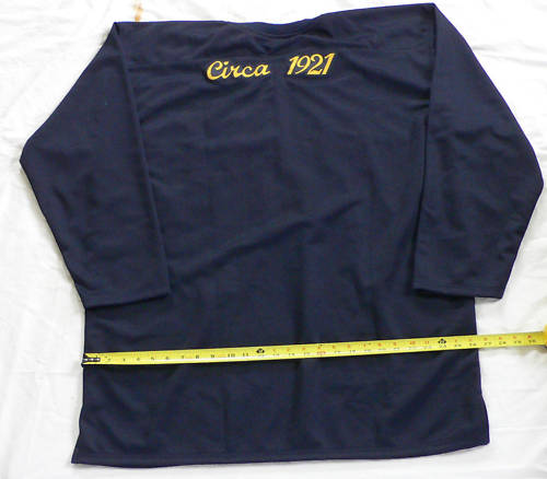 Straightfoward enough - he's even closer to the correct font than the Packers themselves usually get.
So there you have it. I might quibble with a few of the details, but I'm delighted to see these great jerseys made available in any form.
I've long wished that the Packers would capitalize on their long uniform history; in the absence of action from the club, looks like fans are starting to step up. Hope the Packers are paying attention.
2 comments:
Did you know that Acme Packers jerseys also said "Acme Packers" on the back? I saw some evidence of that from original photos that I was shown from one of the heads of the packers HOF.
Wow! I've never heard that before - that bears much more research.
Post a Comment