Centers previously had to choose numbers between 50 and 59, with 60 to 79 available if 50 to 59 weren't available. They now may choose any number between 50 and 79.The NFL originally experimented with assigning numbers by position in 1952, formally codifying the system in 1973 and amending it in 1989.
Defensive linemen may now choose from 60 to 70 and 90 to 99, and linebackers may pick a number from 50 to 59 or 90 to 99. These changes were aimed at recognizing the overlap between linebackers and defensive ends, especially in the 3-4 defense.
Also, the rules now permit a player to move from one position to another and keep his number, if he played the prior position for at least a year and if he is moving from a position that is eligible to receive passes to another eligible position, or if he is moving from one ineligible position to another ineligible position.
Saturday, April 24, 2010
Massaging the Numbers
Lost in the changes to the NFL's postseason overtime rules, announced last month, was a change to the League's player numbering system.
Labels:
2010s,
NFL uniform regulations,
numbers
Tuesday, April 13, 2010
Here Comes the Stuff
 So here we go.
Our first look at the merchandise which will accompany the 1929 throwback uniforms.
 My first thought was "Acme Packers"? The Acme Packing Company was long removed from the picture by 1929.
Since there wasn't anything particularly noteworthy for the sideline apparel from that 1929 season, the team focused in on the Acme Packers, the nickname of the club in 1921-22, to draw on the first decade of the team's existence.Ugh. Not a big fan. I don't mind updating the 1929 uniform to meet the NFL's current equipment regulations, but what's the point of mixing and matching from opposite ends of the decade? It's not as though the Packers needed some excuse to sell Acme Packers merchandise.
"We wanted to give it an old-time, weathered look," (said Kate Hogan, the Packers director of retail operations). "It's really about picking up the colors and what one would say has a 'vintage' feel to it. We really tried to think about what people would like, what they would enjoy. That's what we try and do. We want to make sure our designs keep in mind what our fans would be looking for."
I would also take issue with the notion that "there wasn't anything particularly noteworthy for the sideline apparel from that 1929 season". The '29 Packers wore these sharp pullover jackets, which would translate very well into hooded sweatshirts for retail:
 I also have a hard time visualizing Mike McCarthy wearing the "old-time, weathered look" on the sidelines:
 I do like the leather helmet graphic, though.
 So there you have it. Merchandise goes on sale soon.
We also learned more about when the Packers will be wearing the throwback uniforms:
NFL teams are allowed to have a third jersey that they can wear for up to three games per season (no more than two home games) for a five-year period. Packers President/CEO Mark Murphy said last month that the team will wear it for home games only, for one or possibly two games in 2010, with future use to be evaluated.And about the design process itself:
The Packers first began the process of working toward a third jersey more than a year ago. After first submitting its interest in doing so to the league, the team began to work with the NFL on a couple of different options. Hogan said the league put in a great deal of time and effort to assist the Packers with designs, looking through not only what archives the team had but also those at the Pro Football Hall of Fame. (emphasis mine)Really? Couldn't tell by looking at it, unless they the archive search was ultimately fruitness in helping them find anything distinctive enough to sell. I don't really mind them wanting to jazz up the new sideline and retail gear with a contemporary flair (which is essentially what they did with the throwback uniforms), but linking them to the Acme Packers is odd. It's as though that's going to be the umbrella title for all blue-and-gold from now on out, which is extremely misleading at best.
Finally, this little peek at what might have been:
Hogan said that two of the (proposed uniform designs) were historical ones that were re-creations of uniforms worn in the past, while another was what the league refers to as an 'alternate color' version. Since Green Bay wears green and white jerseys, that alternate jersey would have been a gold one.Hmm. Dodged a bullet there, I think.
But really, for a team with so much glorious history, the Packers have a terribly slapdash approach to honoring it.
 They couldn't even use an appropriate font?
Labels:
1920s,
merchandise,
sideline gear,
throwbacks
Thursday, April 8, 2010
On the Cusp of History
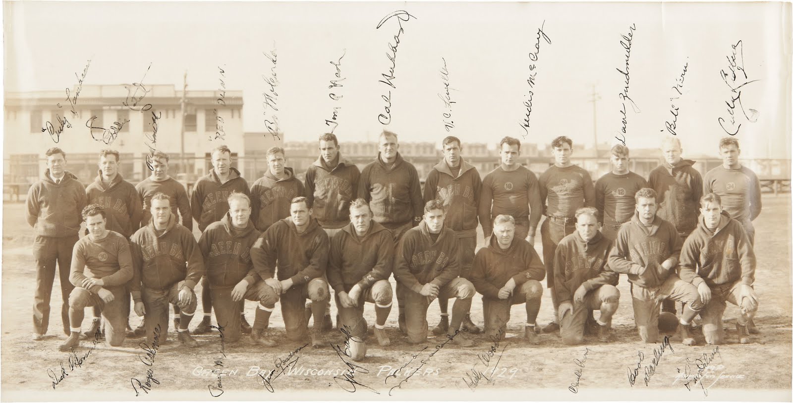
This signed 1929 panoramic photo, from the estate of a former Packers staff member, is currently up for auction. It shows Curly Lambeau and his men in 1929, the team's first World Championship season.

 This uniform, with its blue numbers in gold circles, was worn in 1929 and 1930 and was the inspiration for the Packers' 2010-2014 throwback alternates. In this photo, we also have exemplars of two styles of pullover sideline jackets from the period.
The 1929 squad tore through the National Football League, finishing the season with a 12-1-1 record. The only blemishes in the season were a scoreless tie with the Frankford Yellowjackets and a 16-6 loss to the Memphis Tigers in the final game. Oh, heady days. These men are standing on the cusp of history.
On, you Blue and Gold, to glory,
Win this game the same old story,
Fight, you Packers,
Fight, and bring the bacon home to Old Green Bay.
Labels:
1920s,
championships,
sideline gear,
team photos
Friday, April 2, 2010
Our Page 2 Walk-On
A nice little tip of the cap from ESPN.com's Paul Lukas, using our 1940 newspaper photos as a springboard to talk about the NFL's color history:
Green Bay Packers to Wear Navy in a 2010 GameJust spreading the word....
by Paul Lukas
ESPN.com
March 30, 2010Courtesy of the Green Bay Packers
Can you imagine your Green Bay Packers in an outfit like this?
In case you missed it the other day, the Green Bay Packers recently unveiled a throwback alternate uniform, which they'll wear for one as-yet-unspecified game in 2010. The design is based on what the team wore in 1929.
If the sight of the Pack wearing navy instead of green is a shocker, it shouldn't be. They actually wore a variety of navy-based uniforms for the first several decades of their existence, like this 1940 design. The thing is, color photos from the NFL's early days are rare, so most fans have no idea what their favorite teams used to look like. Neither do many of the game's historians.
That's why a recent discovery by reader Chance Michaels is so amazing. It's a rare newspaper color insert from 1940, providing one of the best views available of the NFL's early color schemes.
Some of the teams are vaguely recognizable — that's an Eagles player at lower right, and a Redskin at lower left (Andy Farkas, incidentally, is generally credited with being the first player to have worn eye-black, even though he's not wearing it in that photo). But it's weird to see Mel Hein of the Giants wearing so much red — and even weirder to see him, as a center, wearing uniform No. 7!
Meanwhile, is that a Cardinals player at upper right? Nope — it's Perry Schwartz of the Brooklyn Dodgers, which was an NFL team for over a decade. And who's that in the center? It's Parker Hall of the Cleveland Rams -- the same franchise that later moved to L.A. and now resides in St. Louis. And they still wear blue and gold, even if the shades have changed.
Labels:
1940s,
press,
team colors
Subscribe to:
Comments (Atom)