Showing posts with label wordmarks. Show all posts

Wednesday, December 18, 2013

"The 26 Teams"

This poster comes from the 1970s, showing the wordmarks of all the teams in the league at the time.

Information on these old wordmarks is hard to come by, but we can narrow down the timeframe. The presence of all the former AFL teams, and the absence of the Seahawks and Buccaneers, helps us date it between 1970 and 1976.

What strikes me today is how many clubs are still using these marks. Here's a version I worked up using the logos from 2013:

In addition to the Packers, the Bears, Bills, Cowboys, Colts and Washington have retained their classic looks virtually unchanged. Those old Browns and 49ers wordmarks endured until relatively recently (2003 and 2004, respectively). Also worth noting that the Vikings have since reverted to an earlier wordmark that predated our poster (the Browns might have, too).

Then there are the minor changes; the Chiefs introduced a modified upper-case version of their old lower-case logo sometime before 1983, the Raiders tightened up their kerning a bit, and the Saints made the most subtle change, losing the dot over their "i".

As for the others, you can see a trend towards arcs, arches and protrusions, meaning the names don't all fit together in my version as neatly as their 1970s counterparts did.

Tuesday, December 6, 2011

Taking Stock, Part II (UPDATED)

At 8 o'clock this morning, Central Standard Time, shares in the Packers went on sale.

In a press conference this morning, Mark Murphy, the Packers' president and chief executive officer, posed with copies of the four previous certificates.

Packers.com

Vice president of finance Paul Baniel then gave us our first look at the new stock certificates:

File/Press-Gazette

Packers.com

Overall, a fantastic design.

I particularly love the sublimated picture of Lambeau Field in the background. This is a great choice. Lambeau Field is inseparable from the team, a symbol of its connection to the fanbase. I loved that the Packers included a rendering on the Super Bowl XLV ring, itself a callback to the 1965 World Championship rings.

In my review of previous stock certificates, I wondered if the Packers were going to replace the photo-negative logo with Dad Braisher's classic (if subsequently tweaked) logo. I'm pleased to see that they have.

I also like the collection of old Packers logos along the bottom, but they jump right from 1921 to 1950, ignoring some blue-and-gold beauties from the 1940s. With all respect to Mr. Murphy, it's hardly "every one of the logos that the Packers have utilized over (their) history." I understand that this late-1940s wordmark might not have made the cut:

Certainly this mid-1940s beauty, used during the Packers' sixth World Championship, would have merited inclusion.

Shame that Curly Lambeau's æsthetic contributions are largely absent from this little gallery of Packers history. Other than that omission, it's a sharp design.


UPDATE 12/7/2011: There's a small-but-crucial detail that I didn't notice until now. Check out the lower-left corner:

Yep. There it is:

Est. 1919

O frabjous day! Callooh! Callay! Obviously I'm not the only one who cares about this.

Nice to see that the Packers themselves remember, even if the League sometimes forgets.

Friday, December 2, 2011

Taking Stock (UPDATED)

The new stock sale is official, and the Packers have announced the first details. Beginning on December 6, the team will be offering 250,000 shares at $250 apiece.

If you weren't able to take advantage of the 1997 offering, this is your chance to put one of these beauties on the wall:

The upcoming issuance is the fifth stock sale in Packer history. In addition to the 1997 offering, stock was sold in 1923, 1935 and 1950.

The Packers first hit on the idea of selling stock as a means of rescuing the team from very precarious financial straits. Head coach and co-founder Curly Lambeau joined with Dr. W. Webber Kelly, grocery man Lee Joannes, attorney Gerald Clifford and A.B. Turnbull, publisher of the Green Bay Press-Gazette in dedicating themselves to raising money for the club, spending so much time with their hands out that they became known collectively as "The Hungry Five". Not just content with seeking donatations, they hit upon the idea of converting the team into a publicly-held, non-profit corporation. 1,000 shares were sold at $5 apiece in conjunction with at least six season tickets.

That first stock certificate was a fairly generic corporate design.

Saved in the short-term, the Packers managed to stave off disaster for a decade before financial problems caught up with them and forced a second sale. In 1935 another sale was held, and $110,000 was raised to help the club. That stock certificate also employed a standard template .

Collection of Don Sipes

As part of the sale the team re-organized with a new corporate name, reflected on the certificate.

This second sale was enough to keep the Packers afloat, but the NFL's smallest market would again be plagued by financial troubles in the late 1940s, and after a series of fundraising drives the Packers still found themselves in need of the cash infusion only a stock sale had brought them. This third sale, in 1950, also helped give the Packers a new start. Curly Lambeau had been forced out, giving the franchise a new head coach for the first time in its history. The team also had a new colorful graphic design, and for the first time the Packers' stock certificates were customized to match:


These certificates featured the team's brand-new wordmark, the team's name superimposed on a football and flanked by goalposts. The Packers raised $118,000 at $25 per share, money the team would need during the lean years ahead.

It was nearly a half-century before the Packers would authorize another stock offering.

This fourth stock sale couldn't have more different circumstances than the previous three. Instead of coming from hunger, the Packers were flush at the very top of the NFL. Instead of needing funds to keep the doors open, the Packers were instead raising money to fund a massive renovation and expansion of Lambeau Field.

Coming on the heels of a Super Bowl win (and immediately before a second consecutive Super Bowl appearance), the Packers raised more than $24 million towards the 2003 renovation. Although 105,989 new shareholders joined the ranks of NFL owners, 279,090 shares remained unsold, and those unsold shares form the basis of the current offering.

I wonder if the new certificates will have the same design as the previous version, or if they'll take the opportunity to tweak it. I've never liked the photo-negative green-on-white Packers logo, not even when they put it on the side of Lambeau Field in the 1990s:

Aside from being less visually pleasing, there's just no reason to have the inverted coloring. Braisher's classic logo, white "G" in green oval surrounded by gold, works as well on a white certificate as it does the team's gold helmets. Maybe the 2011 certificates can fix this æsthetic wrong.

Although those five men could not have known it at the time, the creative solution they devised not only saved the Packers in 1923 but also laid the foundations for a prosperous and successful future, ensuring that the Packers would remain in the NFL, and in Green Bay, long after every other small-town team had either folded or moved to a larger market.

The legacy of the Hungry Five lives on, every glorious autumnal Sunday in old Green Bay. If you haven't joined that legacy yet, your chance begins on December 6th.


UPDATE 12/6/2011: Here is is, and she's a beauty:

A great design. They have indeed replaced the photo-negative logo, and I'm partial to the sublimated photo of Lambeau Field in the background.

Here's the full series, from 1923 through today:


(h/t: Mark Schneider of GLORY DAYS Sports Pub in LaCrosse, WI)

Tuesday, August 30, 2011

Arts and Letter(head)s, Part III

This sterling example of late-1940 Packers letterhead. It was sent on June 1, 1947 to returning players — this particular copy went to defensive tackle Ed Neal — along with the team's playbook.

In the purple ink of a hand-cranked mimeograph machine, head coach Curly Lambeau gives a quick overview of the playbook and invokes secrecy:
BY ALL MEANS DO NOT BE CARELESS IN HANDLING PLAYS. THEY ARE FOR YOUR EYES ONLY. TREAT ALL ADVANCE INFORMATION WITH CONFIDENCE.
The sheet's graphics are bold and clear, six decades later. The top of the letterhead features an unusual wordmark in the team's proud gold and blue.

Along the bottom, partially obscured by Curly's mimeographed signature, flags representing the team's six titles.

The Packers continued to use this style of letterhead even after Lambeau was forced out, as seen on this October 1950 letter from new coach Gene Ronzani to West Coast scout Clark Shaughnessy:

It also appears that the ever-thrifty Packers re-used the old Lambeau letterhead, either before the Ronzani version was delivered or simply to use up old stock. This letter was sent by chairman Lee Joannes on March 5, 1950, almost exactly one month after Ronzani took the reins, as part of a planning session for the team's upcoming stock sale:

Curly's name has been blocked out by a solid blue line:

An ignominious end to Lambeau's thirty years in charge, to be sure, but at least his successors were frugal.

Monday, January 17, 2011

Bumper-to-Bumper

As the Green and Gold cruised to a 48-21 shellacking of the Atlanta Falcons in their own dome, everything was falling into line for the Pack. Rodgers was on fire, the defense was unstoppable, and everything was perfect... except for one tiny detail.

Somewhere along the line, John Kuhn lost the bumper from the back of his helmet, exposing the uneven end of his helmet stripes.

His helmet should have a white bumper bearing the team's stencil wordmark, as seen in this preseason shot:

The rear bumper is one of those places NFL teams can put their wordmarks. Bumpers were originally designed to prevent the helmet shell from cutting into a player's neck—and spinal column—if the facemask got shoved upwards. This was a serious concern in those early days, when the plastic shell was quite controversial, accused of causing and not preventing injuries. Sound familiar? Some modern helmet designs omit the need for a rear bumper altogether with additional interior padding. In that case, the Packers cover the blank space with a decal replicating the approximate look:

Other teams don't necessarily do this. For example, the New York Football Giants are perfectly content to leave bumper-less helmets alone:

Then again, the Giants don't use the rear bumper as a branding opportunity. So the Packers are left with this:

Although I appreciate the uniformity component to uniforms, I think the decal is more a little silly. If the helmet requires a bumper, then put a wordmark on it. But if it doesn't, then the decal is just more needless clutter on an already-crowded helmet.

(h/t: Uni Watch, Brendan Slattery for the screencap)

Monday, December 27, 2010

Shell-shocked

Sharp-eyed viewers noticed something new in last Sunday's game against the Giants. Quarterback Aaron Rodgers, back after sitting out a week with his second concussion of the season, was sporting a new helmet:

That's the Schutt AiR XP, modified with Aaron's standard facemask.

Previously, Rodgers wore a classic Riddell shell. The external difference between the two is most noticeable in the construction of the side and shape of the earhole. Here's his old lid:

Going forward, the round ear hole will be the easiest way to identify pre-Week 16 of 2010 photographs of Rodgers.

From behind, the Schutt looks much the same as his old Riddell:

I hadn't noticed it before, but the Packers have moved the player identification decal off the center stripe. Looking through the archives, this tweak appears to have been made between Week 8 (at the Jets) and Week 9 (against the Cowboys).

Details on the new helmet are sketchy, other than vague reports that it is "specially modified with extra padding to reduce the risk of sustaining another concussion". It isn't clear if those "special modifications" refer to the off-the-rack Air XP, which was originally designed to minimize concussions, or if they're talking about custom modifications to the standard helmet.

Rodgers isn't alone in wearing the AiR XP; it has been seen on Donald Driver, BJ Raji and Sam Shields, among others.

Another interesting note on the Schutt helmet is the team branding on its nose bumper. Riddell is the "official helmet" of the NFL, which means that although players can chose from a list of safety-approved helmets, only Riddell helmets are allowed to display a manufacturer's logo. Teams fill the resulting empty space on non-Riddell helmets with their own iconography; the Packers use their stencil wordmark.

The difference can be seen on Rodgers's two helmets (the photo on the left comes from the October 17, 2010 game against the Dolphins):

Rodgers reportedly took some kidding from his teammates about the new shell:
"His helmet is just hideous, but you’ve got to do what you’ve got to do. It scrunches his face up pretty bad."
– wide receiver Greg Jennings

"He does have an ugly-looking helmet. But we’ve got him back."
– cornerback Charles Woodson

Rodgers's new helmet is one more step away from the iconinc "round-hole" Riddell look, which has defined the football helmet at least as far back as the 1970s. Renderings of the helmet are used as alternate logos by every team in the NFL.

The Cleveland Browns take it one step further, using this particular rendering as their primary logo.

The Packers, for their part, use the same graphic on all manner of team merchandise, everything from smokeless candles to this customizable sweatshirt:

I wonder what will happen as more and more players move away from the standard Riddell shell to different (and distinctive) profiles, if this graphic will be phased out of use or will begin to take on a "throwback" patina.

Tuesday, July 27, 2010

Ol' Blue Eyes is Back

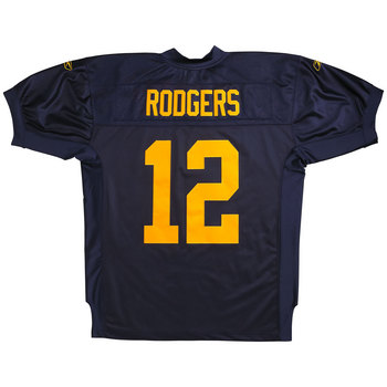
Well, after all the waiting, the third jerseys (and related merchandise) have arrived at the Packers Pro Shop.

Jerseys are currently being offered in two flavors, Authentic and Replica. Authentic jerseys have cuffed sleeves and tackle-twill numbers:

Replicas have loose sleeves and silk-screened numbers:

Also available, as one might suspect, is a whole range of merchandise and casual wear. From helmets to genuine authentic sideline gear, casual wear to tchochkes galore.

As a fan of the blue and gold color scheme (and pretty much anything which helps raise awareness of the Packers' long and glorious pre-Lombardi history), I approve, although it's a little disappointing that much of the throwback merchandise is wholly inauthentic, designed entirely in the 21st Century for a modern audience and bearing little to no resemblance to anything actually found in the period.

There is a certain justification for this; as the concept of "brand identity" was not yet in vogue in the 1920s. Teams never foresaw the merchandising boom which drives and defines the modern game, and consequently many of today's hallmarks have no historical antecedents.

To that end, I understand the decision to conflate elements from different points of the 1920s into one identity system. The 1929 jersey doesn't carry with it a contemporaneous logo, so we reach back to 1921, and "ACME PACKERS" side sits by side with the much-later jersey.

Still, there's no reason that the Packers couldn't have used the actual period wordmark. The original, as we've seen, was a bold sans-serif, gold letters across the navy jersey.

The contemporary merchandise uses a few different wordmarks, none of them particularly close to the original.

There is one product, however, which is worth special mention.

This Acme Jersey Tee, from throwback jersey manufacturer Mitchell & Ness, is "designed to replicate the original 1929 jersey." Aside from their annoying tendency to slap their logo on everything they can, it's a pretty good throwback.

The number on the front is comprised of two letters of felt appliqué:

This could be the first commercially available 1929 throwback jersey. Pity they don't offer number customization; there are four members of that 1929 Blues club in the Pro Football Hall of Fame, and Curly Lambeau's #20, Johnny Blood's #24, Cal Hubbard's #39 or Mike Michalske's #36 would be so much better than the generic double-zero.

Beautiful. And as close a replica as you're likely to see of the actual jersey, worn by the Packers when they captured their first World Championship eight decades ago.

You might not be able to play like Johnny Blood, but at least you can dress a little like him.