Tuesday, September 14, 2010

Green, Gold and the Great White Way

After October 21, 2010, Broadway may never be the same.


As both a theatrical producer and Packer fan, I've been following this production's development with some interest. It sits right there at the intersection of two of my great loves, making me more or less this show's natural audience.

LOMBARDI is written by Steppenwolf Theatre member (and Wisconsin native) Eric Simonson, adaptated from When Pride Still Mattered: A Life of Vince Lombardi by Pulitzer Prize-winning author David Maraniss. Simonson previously adapted the Maraniss biography into a different play, called "The Only Thing", for the sadly-defunct Madison Repertory Theatre in 2007.

The show stars Dan Lauria (The Wonder Years) and Judith Light (who was magnificent in Wit Off-Broadway, but is best known for her television work on Who's the Boss) as Vince and Marie Lombardi. It is produced by Tony Ponturo and Fran Kirmser, in partnership with the NFL, and directed by Thomas Kail. Rounding out the creating team is David Korins (Scenic Design), Paul Tazewell (Costume Design), Howell Binkley (Lighting Design), Acme Sound Partners and Nevin Steinberg (Sound Design), and Zachary Borovay (Projection Design).

Previews begin September 23, and it opens on October 21. It will run at the Circle in the Square Theatre in midtown Manhattan.

Set in 1965, the narrative concerns a reporter (played by Keith Nobbs) who has come to Green Bay to do a story on Lombardi. From one of the show's television commercials:
My name's Michael McCormick. I'm a sports reporter for Look magazine. My next story is on Vince Lombardi, coach of the World Champion Green Bay Packers. He wins practically all the time, and no one knows exactly why or how. It's my job to find out, and it's Coach Lombardi's job to keep me from finding out. Everything's a contest with him. Same for me. May the best man win.
This is a classic dramatic conceit: the outsider introduced into an existing world. He serves as the audience surrogate, an excuse to introduce all the expository material that we'll need to understand the world of the play. He has a second function in this case; by inserting a fictional character among real people the playwright has a free hand to explore motivations and an emotional journey that those real people might prefer not be attached to their names.

I'm curious to see how they make the narrative work, if this conflict they've created can be sustained over 90 minutes, and if they try to assign some type of character arc to Lombardi himself or keep it within the fictional creation McCormick.

Of course, I'm also curious as to how the production will treat one of Lombardi's most enduring legacies, his classic Packer uniform. You knew that it had to make an appearance, right? The show can't all be serious speeches in suits and narrow ties. These production photos were taken during the show's out-of-town tryout in Great Barrington, Massachusetts, and should give us a pretty good idea of what the Broadway production will look like, starting with the entire cast:

left to right: Dave Robinson (Robert Christopher Riley), Paul Hornung (Bill Dawes), Jim Taylor (Chris Sullivan), Vince Lombardi (Dan Lauria), Michael McCormick (Keith Nobbs) and Marie Lombardi (Judith Light)

The uniforms look accurate enough at first glance. Although Lombardi's design underwent a series of changes in its first several seasons, by 1965 all the elements that today we associate with the uniform were in place; the particular block number font had been added the season before and the green/white/green pants stripes (matching the helmet) were in their third season.

I do have one nitpick, and it's that the three gentlemen are wearing their socks like baseball players. Note to Mr. Tazewell: football players never let their stirrup straps show. Going back to the earliest days of the pro game they have always worn low whites over the colored stirrups. Those whites have been pulled up to various degrees, in the case of Lombardi's Packers covering not only the straps but frequently the team's distinctive stripes as well:

A minor detail, but hey. They're so close in other respects.

Of course, Vince Lombardi had a uniform of his own, and Lauria wears it well:

Dan Lauria

That's the classic Lombardi game day sideline look - fedora and camel hair coat over the pullover team jacket. We also get a view of Lauria in Lombardi's practice regalia:

Keith Nobbs and Dan Lauria

Ah, my favorite Packers logo of all, the interlocking GB. Introduced by Lombardi, it was worn on practice caps through his tenure and on into the Phil Bengston and Dan Devine eras.

On the non-uniform front, we have these photos to give us a general sense of the production. Circle in the Square is an inspired choice - an intimate house with a thrust stage to highlight the small two-character scenes, perfect for this kind of show.

Dan Lauria

Judith Light and Dan Lauria

Dan Lauria

Dan Lauria and Judith Light

Sports movies are tough enough to make work, but a play set in the world of sports is a unique animal. A play can't fall back on the manufactured drama of The Big Game in the third act. A play can't offer up endless montages of game action to cover structural weaknesses. A play is actors, audience, no place to hide. Emotions carried through the air by the playwright's words.

Now, I can see this going one of two ways: the producers will either make us care about the Lombardi character as a human being, or they will be content to collect our money and feed us our own edited nostalgia, a "greatest hits" clip show of Lombardi's pithy quotes, inspirational speeches and sideline rants.

I'm curious to see if the story can really stand on its own, if it has the emotional weight to justify the $150 (and up) ticket, or if it's just a jukebox musical for sports geeks. I have tickets for the first week. Should be interesting.

Return of an Old Friend

Uni Watch comes through with another great catch from Sunday's game against the Eagles (which I still haven't been able to watch in full). This time the find comes from reader Ryan Kuehn, who noticed the return of a classic Packers logo: the Packers were wearing the old "Heisman/Wisconsin" logo on their visor tabs.

The best shot I've been able to find so far is this picture of Cullen Jenkins sacking Philadelphia quarterback Kevin Kolb:

It's hard to see in action, but when magnified the logo is clearly identifiable.

Even in the magnification it's hard to say conclusively if the logo has been updated in any way or if they're using the original, but it appears to be the standard early 1960s design, including separate dots on the state marking both Green Bay and Milwaukee, the team's two homes from 1933 through 1994.

This was a particularly good catch, since so few players were wearing visors:

I've been pouring over game photos, and it appears that Jenkins and safety Nick Collins were the only two Packers wearing visors. You can just make out the tabs on Nick Collins's helmet (left):

The "Heisman/Wisconsin" logo (which really needs a catchier name - any ideas?) was introduced early in Lombardi's tenure.

Although it was never used on the uniforms, it was extensively used on cards, team publications, letterhead, game tickets, and the like.

It was also featured on some training and sideline wear, including this "Staff" jacket worn by Lombardi in December of 1965:

The logo was phased out after the Lombardi era as the helmet "G" began to be used more and more as the club's primary logo. It was rediscovered in the 1990s as teams became more aware of value (and, more importantly, the marketability) of their own history. Unfortunately, the poor state of pro football uniform research at the time often led to it being oriented incorrectly. Instead of the proper angle, the football was often placed on a directly vertical line, as seen here on an early Mitchell & Ness shirt:

That error seems to have been corrected, by and large. And to my knowledge, this is the first time the logo has actually appeared on a uniform, which takes all that merchandise out of the "throwback" realm and makes it current.

I love this logo. The rendering is somewhat crude, with the white-one-white-on-white player, but it's a perfect representation of Lombardi's "run to daylight" philosophy. The little guy looks like he's shrugging off defenders while executing a perfect Green Bay Packers' Power Sweep.

This logo seems to me to be a perfect candidate for an update. Give it a more detailed rendering, maybe along the lines of the Lambeau Field logo, and it's good for another few decades.

(h/t: Ryan Kuehn, Uni Watch)

Monday, September 13, 2010

Patch Job

Living in New York, I seldom have the opportunity to watch the games live, even on television. More often than not, I have to stream the game online until my Wisconsin source sends me a DVD. Yesterday's game was one of those, and while I was refreshing my Scorecenter ap every three seconds, I missed an absolute doozy of a uniform note. Running back Brandon Jackson's TV numbers were sewn onto patches, then apparently applied over a different set of numbers.

Uni Watch reader Adam Pavlovich got a screen grab:

That looks like a "2" on his left shoulder.

Last-minute modification? I'm contacting the Packers, see if we can get an answer.

(ht: Adam Pavlovich & Uni Watch)

Wednesday, September 1, 2010

So Simple, It's Perfect

This morning, Nike unveiled its new slate of special "Pro Combat" uniforms for the college teams they outfit. Among the standard hyper-futuristic designs on display is this 1967 throwback for the Oregon State Beavers:

Most notable are the sleeve stripes, which have been moved to the compression shirts:

What a novel idea, preserving 1960s design with twenty-first century technology. If Oregon State can do this, then why can't the Packers?


UPDATE: Paul Lukas posted more pictures of the uniform on ESPN.com as part of his coverage of the unveiling:

The undershirt looks pretty good in its own right. I can easily imagine a green-and-gold version for sale at the Pro Shop:

Here's Paul's take (emphasis mine):
Surprisingly old-school, no? ... Hard to believe this is the same school that wore that sports bra design a few years back. ... A few minutes before the unveiling, a guy from Nike introduced himself to me, pointed at this design, and said, "I worked on all of these, and this is the best one of the bunch." Hard to disagree. ... Matte-finish helmet is interesting. ... Putting the sleeve stripes on the undersleeves, instead of on the actual jersey, is probably the future of football striping.
We can certainly hope so.

Wednesday, August 25, 2010

Living Color

With so much of the Packers' early history preserved only in black and white photos, it's a pleasant change to see a color image, even if we have to make one ourselves.

This image was colorized by Phil Hecken, who writes the weekend columns for the Uni Watch blog (and who has assumed the day-to-day duties while Paul is on his August sabbatical).

Phil uses the freeware GIMP (Graphic Image Manipulating Program)to colorize old black and white photos.

The choice of red for the defender was interesting. He explains:
i have NO IDEA if the colors of the opposition are correct — just an educated guess after having worked with b & w for a little while now…
Looked to me as though it could have been the Cardinals, but two readers suggested the Lions, and sure enough, after a little digging I learned that the photo was taken at a 1945 game in Milwaukee against... Detroit. A game the Packers won 57-21.

Another reminder that even veteran photo editors can be fooled by black and white photos. When reduced to shades of gray, reds appear blue and vice versa. Phil promises to re-do the picture in Honolulu Blue soon, and while he's at it give us a tutorial on his process.

More to come.

Tuesday, August 10, 2010

Pitchers and Catchers Report?


This training camp screenshot comes from the collection of Robert Harvell, auction director at GUU Auctions.
"That's from the Packers' training camp, circa early '60s. Apparently typical football pads weren't enough for the hard-hitting packers — they had to resort to catcher’s gear as well! I'm not sure if those are special leg pads or simply two more chest protectors wrapped around each leg."
Anybody seen anything like that before?

I always love seeing Lombardi in that interlocking "GB" cap.

UPDATED: "Mr. Lambeau" at the incredible PACKERVILLE, U.S.A blog took this screencap from HBO's new Lombardi documentary, giving us a look at the pads in color:


(h/t: Robert Harvell, UniWatch, PACKERVILLE, U.S.A.)

Tuesday, August 3, 2010

Silver Anniversary, Green Pennant

Although the Packers wore blue uniforms throughout most of Curly Lambeau's tenure, much of the (admittedly rare) merchandise produced during that time was emblazoned with the green and gold which has since come to define the team.

Consider this pennant from the 1944 season:


Blue and gold uniforms, but a green and gold commemorative pennant. It's true that there wasn't as much of a direct focus on team colors as there is today, but even so.

The Packers would continue to list "blue" as an official team color well into the 1960s, perhaps because they were still wearing the old blue sideline capes.

Thursday, July 29, 2010

Camel's Nose, Meet Tent (Part Two)

Packers guard Daryn Colledge models the new practice jersey patch during training camp practice at Ray Nitschke Field on Sunday, Aug. 1, 2010.

A little over a year after announcing that they would seek a jersey sponsor for practice uniforms, the Packers have announced that a deal has been reached with Green Bay-based health care provider Bellin Health.

As reported yesterday in the Milwaukee Journal Sentinel:
Packers to wear advertising patch
Team follows trend of other NFL organizations


By Don Walker
Posted: July 28, 2010

Beginning with the first practice at 2 p.m. Saturday, members of the Green Bay Packers will wear an advertising patch on their practice jerseys.

That is a first for the franchise, and follows a trend of other National Football League teams that have signed deals with major sponsors that involve the addition of an advertising patch on practice jerseys.

The Packers' advertising partner is Bellin Health, a major health provider in northeast Wisconsin. The patch will be worn on the player's left side near the shoulder.

Bellin Health and the Packers have been partners for several years. The introduction of the patch on the practice jersey - allowed under NFL rules - is part of a multi-year agreement with Bellin Health.

The patches will not be worn in preseason games or the regular season.

...

Craig Benzel, the Packers' director of marketing and corporate sales, said the team wanted to select a sponsor that was community-minded.

"It was important for us to align with a partner we have worked closely with in the past," Benzel said. "It was important that they are so community minded."

The patch itself, he said, is tasteful. "We think the size is perfect," Benzel said.
A local sponsor makes sense, since the practice jerseys don't see much press outside of the immediate area.

UPDATE: Now we've seen it (above). Not sure I'd call it "tasteful" myself, but so long as it remains confined to Nitschke Field I'm okay with it.

Wednesday, July 28, 2010

A Good Sign

The NFL has created a new warning sign about the effects of concussions, to be hung in every locker room this upcoming season.

A version of this will also be given to all active players in the form of a brochure.

I'm still concerned that the focus on concussions allows the league to ignore the greater problem of chronic traumatic encephalopathy (CTE). CTE may be caused by repeated blows to the head, even those that don't necessarily rise to the level of a concussion. Evidence suggests that the small hits that every player takes again and again and again over decades of play, can add up and finally trigger the onset of the progressive neurodegenerative disease. Pretending that concussions are the only problem, or even the primary problem, is to ignore this great danger lurking on the field of every game.

But small steps. What's really important here is that after years of denial, the NFL is finally admitting that the game has serious and long-ranging consequences for the men who play it. And it's about time.

Tuesday, July 27, 2010

Ol' Blue Eyes is Back

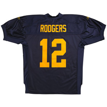
Well, after all the waiting, the third jerseys (and related merchandise) have arrived at the Packers Pro Shop.

Jerseys are currently being offered in two flavors, Authentic and Replica. Authentic jerseys have cuffed sleeves and tackle-twill numbers:

Replicas have loose sleeves and silk-screened numbers:

Also available, as one might suspect, is a whole range of merchandise and casual wear. From helmets to genuine authentic sideline gear, casual wear to tchochkes galore.

As a fan of the blue and gold color scheme (and pretty much anything which helps raise awareness of the Packers' long and glorious pre-Lombardi history), I approve, although it's a little disappointing that much of the throwback merchandise is wholly inauthentic, designed entirely in the 21st Century for a modern audience and bearing little to no resemblance to anything actually found in the period.

There is a certain justification for this; as the concept of "brand identity" was not yet in vogue in the 1920s. Teams never foresaw the merchandising boom which drives and defines the modern game, and consequently many of today's hallmarks have no historical antecedents.

To that end, I understand the decision to conflate elements from different points of the 1920s into one identity system. The 1929 jersey doesn't carry with it a contemporaneous logo, so we reach back to 1921, and "ACME PACKERS" side sits by side with the much-later jersey.

Still, there's no reason that the Packers couldn't have used the actual period wordmark. The original, as we've seen, was a bold sans-serif, gold letters across the navy jersey.

The contemporary merchandise uses a few different wordmarks, none of them particularly close to the original.

There is one product, however, which is worth special mention.

This Acme Jersey Tee, from throwback jersey manufacturer Mitchell & Ness, is "designed to replicate the original 1929 jersey." Aside from their annoying tendency to slap their logo on everything they can, it's a pretty good throwback.

The number on the front is comprised of two letters of felt appliqué:

This could be the first commercially available 1929 throwback jersey. Pity they don't offer number customization; there are four members of that 1929 Blues club in the Pro Football Hall of Fame, and Curly Lambeau's #20, Johnny Blood's #24, Cal Hubbard's #39 or Mike Michalske's #36 would be so much better than the generic double-zero.

Beautiful. And as close a replica as you're likely to see of the actual jersey, worn by the Packers when they captured their first World Championship eight decades ago.

You might not be able to play like Johnny Blood, but at least you can dress a little like him.