Guy Hankel has a new post on his blog White Mesh and Green Durene.
This jersey is falsely being offered as a Bart Starr game-worn. In addition to breaking down the claims one by one, Guy gives his a good look at the Packers' 1960s jersey tagging.
It's a must-read for anyone considering purchasing a game-worn jersey, and a reminder that a little bit of homework can save you an awful lot of trouble.
The 1919 Packers dominated Wisconsin's semi-professional football scene, winning their first ten games by a staggering combined score of 565-6. The Racine Iroquois were the only team to even score against Green Bay's mighty Blues, scratching out six points (trimming the Packers' lead in the game to a mere seventy points). The Packers would meet finally their match in the final game of the season, when the Beloit hometown ref called back three Packer touchdowns and the mighty Blues fell to the Beloit Fairies (named for their sponsor, the Fairbanks-Morse Company), 6-0.
Curly dressed his boys in navy shirts and gold pants, reminiscent of his Notre Dame alma mater. Helmets, for the few who wore them, were unpainted leather.
That's Packers co-founder George Whitney Calhoun looking sharp in his very cool bow tie. Curly sits front and center with the ball. These men could now have known it at the time, but their eleven games in 1919 were the beginning of a glorious tradition. They were the first representatives of the most successful pro football team in history.
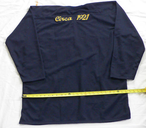
An interesting find on eBay right now - an industrious seller is selling re-creations of various Packer jerseys. Although he mentions wanting to produce every jersey style the Packers have worn, he currently has four versions available.
Each of the current offerings is marred (to my eye) with a "Circa ____" designation across the shoulders. This varies from mildly annoying to seriously distracting, based on how busy the jersey itself is.
First up is a beauty from 1923. We've talked about this jersey before - it was the first major departure for Curly Lambeau - after four years of navy jerseys with gold trim, he swapped the color scheme and introduced a gold jersey with nine thin navy stripes on each sleeve. It was worn with gold socks and dark gold pants, creating the team's first monochromatic uniform.
Now we can see what that jersey might have looked like in person.
I think this one is gorgeous. I'd be tempted to pick one up myself. Very unique, from a forgotten moment in Packers history.
This next one is interesting - it's reproduction of the Packers' 1927 jersey. The team's media guide describes the uniform as "Elaborate, jockey-like jerseys, with inverted triangle tracing clavicles and 13 blue and gold vertical stripes from chest to stomach; faded blue canvas pants, gold socks with two blue stripes".
It's not perfect (his stripes are far straighter and more evenly placed than the originals) but it's still pretty fun. I suspect that the Packers meant that the gold "ribbing" against the blue jersey gave the impression of gold and blue stripes, rather than having blue stripes actually sewn on to the jersey.
The stripes themselves were intended to grip the ball when held tight against the player's body - under the rules at the time, ballcarriers were not down by contact but had to be physically stopped. So it wasn't uncommon for backs to go down to the turf and scramble back up again, and they sought any advantage they could get to help them hang on to the ball.
Personally, I love this look. It's an iconic image of early 20th-century football, evoking a rough-and-tumble struggle for yards in the mud. It made a brief resurgence in 1994, when the Steelers and Bears wore updated versions as part of the NFL's 75th anniversary throwback celebration. It's also handy for anyone looking for some easy shorthand to borrow some of the mystique of early football:
The classic Lambeau uniforms don't get nearly the respect they deserve. Although emblamatic of the Packers for over a decade, the Packers have never offered them for sale beyond the two Tony Canadeo versions from Mitchell and Ness, leaving it up to fans to make themselves.
His interesting take on this classic jersey is to replicate the short-lived variant with a satin torso, seen here on Arnie Herber and Don Hutson:
This is the one where his "Circa"embroidery bothers me the most, cluttering up the area between yoke and numbers.
Of course, no Packer do-it-yourself throwback jersey collection would be complete without a 1921 "ACME PACKERS" jersey.
Straightfoward enough - he's even closer to the correct font than the Packers themselves usually get.
So there you have it. I might quibble with a few of the details, but I'm delighted to see these great jerseys made available in any form.
I've long wished that the Packers would capitalize on their long uniform history; in the absence of action from the club, looks like fans are starting to step up. Hope the Packers are paying attention.
Lost in the changes to the NFL's postseason overtime rules, announced last month, was a change to the League's player numbering system.
Centers previously had to choose numbers between 50 and 59, with 60 to 79 available if 50 to 59 weren't available. They now may choose any number between 50 and 79.
Defensive linemen may now choose from 60 to 70 and 90 to 99, and linebackers may pick a number from 50 to 59 or 90 to 99. These changes were aimed at recognizing the overlap between linebackers and defensive ends, especially in the 3-4 defense.
Also, the rules now permit a player to move from one position to another and keep his number, if he played the prior position for at least a year and if he is moving from a position that is eligible to receive passes to another eligible position, or if he is moving from one ineligible position to another ineligible position.
The NFL originally experimented with assigning numbers by position in 1952, formally codifying the system in 1973 and amending it in 1989.
My first thought was "Acme Packers"? The Acme Packing Company was long removed from the picture by 1929.
Since there wasn't anything particularly noteworthy for the sideline apparel from that 1929 season, the team focused in on the Acme Packers, the nickname of the club in 1921-22, to draw on the first decade of the team's existence.
"We wanted to give it an old-time, weathered look," (said Kate Hogan, the Packers director of retail operations). "It's really about picking up the colors and what one would say has a 'vintage' feel to it. We really tried to think about what people would like, what they would enjoy. That's what we try and do. We want to make sure our designs keep in mind what our fans would be looking for."
Ugh. Not a big fan. I don't mind updating the 1929 uniform to meet the NFL's current equipment regulations, but what's the point of mixing and matching from opposite ends of the decade? It's not as though the Packers needed some excuse to sell Acme Packers merchandise.
I would also take issue with the notion that "there wasn't anything particularly noteworthy for the sideline apparel from that 1929 season". The '29 Packers wore these sharp pullover jackets, which would translate very well into hooded sweatshirts for retail:
I also have a hard time visualizing Mike McCarthy wearing the "old-time, weathered look" on the sidelines:
I do like the leather helmet graphic, though.
So there you have it. Merchandise goes on sale soon.
We also learned more about when the Packers will be wearing the throwback uniforms:
NFL teams are allowed to have a third jersey that they can wear for up to three games per season (no more than two home games) for a five-year period. Packers President/CEO Mark Murphy said last month that the team will wear it for home games only, for one or possibly two games in 2010, with future use to be evaluated.
And about the design process itself:
The Packers first began the process of working toward a third jersey more than a year ago. After first submitting its interest in doing so to the league, the team began to work with the NFL on a couple of different options. Hogan said the league put in a great deal of time and effort to assist the Packers with designs, looking through not only what archives the team had but also those at the Pro Football Hall of Fame. (emphasis mine)
Really? Couldn't tell by looking at it, unless they the archive search was ultimately fruitness in helping them find anything distinctive enough to sell. I don't really mind them wanting to jazz up the new sideline and retail gear with a contemporary flair (which is essentially what they did with the throwback uniforms), but linking them to the Acme Packers is odd. It's as though that's going to be the umbrella title for all blue-and-gold from now on out, which is extremely misleading at best.
Finally, this little peek at what might have been:
Hogan said that two of the (proposed uniform designs) were historical ones that were re-creations of uniforms worn in the past, while another was what the league refers to as an 'alternate color' version. Since Green Bay wears green and white jerseys, that alternate jersey would have been a gold one.
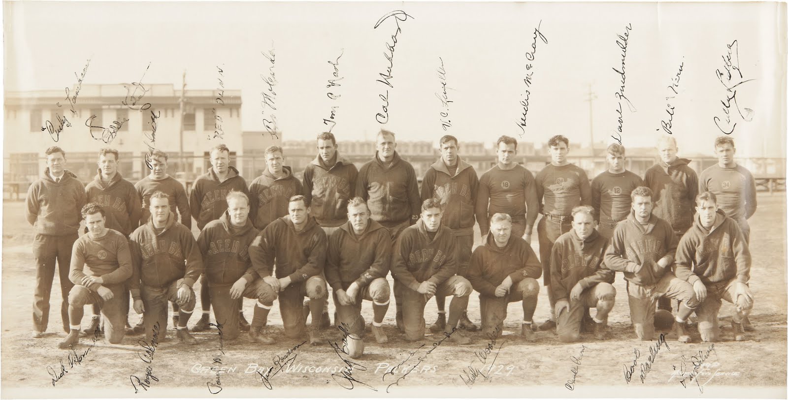
This signed 1929 panoramic photo, from the estate of a former Packers staff member, is currently up for auction. It shows Curly Lambeau and his men in 1929, the team's first World Championship season.
This uniform, with its blue numbers in gold circles, was worn in 1929 and 1930 and was the inspiration for the Packers' 2010-2014 throwback alternates. In this photo, we also have exemplars of two styles of pullover sideline jackets from the period.
The 1929 squad tore through the National Football League, finishing the season with a 12-1-1 record. The only blemishes in the season were a scoreless tie with the Frankford Yellowjackets and a 16-6 loss to the Memphis Tigers in the final game. Oh, heady days. These men are standing on the cusp of history.
On, you Blue and Gold, to glory, Win this game the same old story, Fight, you Packers, Fight, and bring the bacon home to Old Green Bay.
A nice little tip of the cap from ESPN.com's Paul Lukas, using our 1940 newspaper photos as a springboard to talk about the NFL's color history:
Green Bay Packers to Wear Navy in a 2010 Game by Paul Lukas
ESPN.com March 30, 2010
Courtesy of the Green Bay Packers Can you imagine your Green Bay Packers in an outfit like this?
In case you missed it the other day, the Green Bay Packers recently unveiled a throwback alternate uniform, which they'll wear for one as-yet-unspecified game in 2010. The design is based on what the team wore in 1929.
If the sight of the Pack wearing navy instead of green is a shocker, it shouldn't be. They actually wore a variety of navy-based uniforms for the first several decades of their existence, like this 1940 design. The thing is, color photos from the NFL's early days are rare, so most fans have no idea what their favorite teams used to look like. Neither do many of the game's historians.
That's why a recent discovery by reader Chance Michaels is so amazing. It's a rare newspaper color insert from 1940, providing one of the best views available of the NFL's early color schemes.
Some of the teams are vaguely recognizable — that's an Eagles player at lower right, and a Redskin at lower left (Andy Farkas, incidentally, is generally credited with being the first player to have worn eye-black, even though he's not wearing it in that photo). But it's weird to see Mel Hein of the Giants wearing so much red — and even weirder to see him, as a center, wearing uniform No. 7!
Meanwhile, is that a Cardinals player at upper right? Nope — it's Perry Schwartz of the Brooklyn Dodgers, which was an NFL team for over a decade. And who's that in the center? It's Parker Hall of the Cleveland Rams -- the same franchise that later moved to L.A. and now resides in St. Louis. And they still wear blue and gold, even if the shades have changed.
This rare color photo of Green Bay passer Cecil Isbell was published in the New York Sunday News on September 29, 1940, as part of a photo essay entitled "Pro Grid Aces Who Star Among Stars".
This 23-year-old Houston, Tex., wizard is the football players' football player and rated as one of the most polished performers in the business. He does everything well, but his forward passing is something the fans rave about—and so do his appreciative teammates on the champion Green Bay Packers. In fact this six-foot-one, 190-pound, former Purdue star blazed into fame when he paced an all-star college team and out-passed the famed Slingin' Sammy Baugh of the crack Washington Redskins in 1938. Last year, his second with the Packers, Isbell whipped 73 successful passes—eight for touchdowns—for a gain of 749 yards in 103 tries.
It seems strange to see a quarterback wearing #66, but this picture was obviously taken in the pre-season, when players seemingly wore whatever jersey the equipment manager had handy. Isbell wore #17 throughout his career in blue, as seen in this photo of Isbell and Hutson taken at the All-Star Game on August 29, 1940:
This is Curly Lambeau's classic blue and gold uniform, introduced in 1937. The sock stripes were removed after a few seasons, although it's hard to establish exactly when, as many players of the late 1930s/early 1940s seemed to have eschewed the full socks altogether (at least in the warmer months). In this photo from Wrigley Field, we have one Packer wearing striped socks and Isbell (with the ball) wearing no blue socks at all, only the low whites:
The bare-leg fashion seems to have passed by the mid-1940s, and when socks returned as a permanent part of the uniform they were solid navy, as seen in this 1947 photo:
The stripes would make an appearance on the 1994 throwbacks:
Isbell himself is an underappreciated part of Packers history. Drafted out of Purdue in 1938, he took the league by storm. As the caption notes, he led his team to a surprise win over the Redskins in the 1938 College All-Star Game (which at the time featured the best college athletes against the reigning NFL champions).
Isbell had just as much success in the pros, gradually taking the passer role over from Arnie Herber. He platooned with Herber for the first three years of his career in the "Notre Dame box" formation. This allowed Lambeau to use him as either a passer or a rusher - he led the Packers in rushing in 1938 and 1939, and the entire NFL in rushing average in 1938. As a passer, he led the league in attempts, completions, passing yards and touchdowns in 1941, and completions, yards and touchdowns in 1942.
The 1942 season was to be his last - Isbell only played five years with the Packers before retiring from pro football at 28. He later explained "I saw Lambeau go around the locker room and tell players like Arnie Herber that they were done. I vowed it would never happen to me." Having left on his own terms, Isbell returned to his alma mater as a coach. He has been selected to the NFL's 1930s All-Decade Team despite only playing his rookie and sophomore seasons in the 30s.
Although Isbell was inducted into the Green Bay Packers Hall of Fame in 1972, his short career has led him to be largely, and unjustly, forgotten by football fans. Had Isbell continued to play in blue and gold, he may well have followed Baugh into Canton.
"Hutson and Herber were the absolute perfect combination for a quarterback and a receiver. You had a guy who could throw the ball 65 yards in the air, and you had a reciever who could get downfield and outrun everybody. I mean, the first time Herber completed a pass to Hutson was in a game against the Bears for 83 yards for a touchdown."
- Dan Daly, The Washington Times
That's evident in this set of screencaps showing Herber dropping back and tossing a bomb to Hutson, who separates himself from the defenders and runs it home:
No color this time, unfortunately. But we are treated to a few seconds of the 1937 short film Pigskin Champions, which featured the World Champion Packers in an intrasquad exhibition of football skills.
That's Herber leading the offense in borrowed white jerseys. The defense is wearing the 1935-1936 uniform, kelly green shirts with gold sleeves and pants, topped off with the striped helmets.
As Curly leads the men in calisthenics, we get a pretty good look at the uniforms:
This might have been the last appearance of this uniform set - by the time the film was distributed in October of 1937, Lambeau had brought back the navy-and-gold color combination and introduced his classic gold-yoked uniform.
Pigskin Champions is extremely hard to find. I know that it was played on Green Bay television as part of special programming around Super Bowl XXXI. Taped copies of that presentation circulate every now and then - if anybody has a copy, please drop me a line.
Here's my take, a few days on. The first thing we need to do is recognize the constraints of creating a 1920s football uniform in the 2010 National Football League. There are two kinds of retro uniforms - throwback, and fauxback.
A throwback uniform tries to give the impression of actually being "back in the day." It replicates the styling and construction of the original, sometimes even using the original materials. This is more common in baseball, as in this 2007 Washington Nationals game (note the baggy 1940s uniform fit):
A fauxback uniform is essentially "what the team would wear now if they never changed their uniform style". It allows for innovation in manufacture, cut and construction, everything except the uniform's style.
This is what we see in the NFL, where the uniforms are old style but perfectly modern right down to the League's shield at the neck. It's not disparaging—all modern NFL throwbacks are actually fauxbacks, and have been for years. We're not likely to see Reebok forgo its logo off just because Johnny Blood didn't wear one.
So we're not going to pretend that Rodgers & Company will take the field in leather and wool. This is the Packers' interpretation would be if the 1929 look had taken hold like the Yankees' pinstripes, or like Lombardi's late 1960s uniforms.
JerseysMy initial reaction when we saw the jersey was that the number circle is huge.
In context, on the players, it looks more reasonable. It's still larger than I would have liked, but not as overwhelming.
If this is the best the Packers could do within the constraints of the NFL's uniform regulations, then I'm all for it.
I can't have been the first to note a resemblance to Marquette's racing-stripe basketball uniforms from the late 1960s and early 1970s (right). A friend mentioned that it reminded him of an old Porsche or Vette. A classic Le Mans sort of vibe.
The circle's really grown on me, especially since it's the only gold visible on the front of the uniform. It's sporty, distinctive. And gives Rodgers a nice target to hit.
On the back, we have the standard names and numbers.
Obviously, names weren't there on the originals. I'm not sure about the numbers. We know that the Packers were using thin numbers, possibly gold, on the backs of their jerseys in 1932. It's certainly possible that the '29 Packers had gold block numbers on the back.
Pants and socksThe pants are simple tan, a visual echo of the canvas pants worn by the original club. Socks are navy, apparently worn without any whites at all. Not much to say about either of these, except that I approve wholeheartedly. A clean, classic look.
HelmetsHere's where the limitations of a fauxback design start to show themselves. Helmets of today bear no resemblance to the leather helmets of yore.
In 1929, helmets were strictly optional—the NFL didn't mandate helmet use for all players until 1943—and there was no standard team design. The construction of the leather panels provided its own design, completely lost on the modern helmets.
The old helmets didn't need a logo or stripes to have visual appeal - the construction gives it texture. Blank modern shells just don't look right - too much unbroken material. For the record, this was a problem I had with the 1994 throwbacks as well:
The originals look great, but the modern interpretations look unfinished and awkward.
While I appreciate what the Packers are trying to do with the brown helmet, I can't help but think that there's a better approach than blank brown shells with gray facemasks.
Perhaps if they added some subtle shading, a slightly darker shade of brown, it might hint at the old leather strips (excuse the rushed Photoshop job):
This would be similar to what the Michigan Wolverines (and less famously, the Delaware Blue Hens and Princeton Tigers) do with their helmets. Although these schools abandoned the winged leather helmets half a century ago, they retained the old layout. The pattern, once painted onto alternating strips of leather, gives a visual echo of old construction on the contemporary shells.
The Packers could do something similar by layering browns, giving the helmet more visual interest than a blank shell. I think it would be a huge improvement, and it would patch the only real problem I have with the throwback uniforms.
So there you have it. Although not without minor problems, on the whole it's a great look. I'm glad that the Packers are reaching back into their long storied history, and taking a pretty big risk in doing so. They could have "thrown back" to the 2001 Thanksgiving Day whites, or to the 1994 classics, either of which would be easier to translate to the modern uniform template. Instead, they went out on a limb with a classic needing a great deal of interpretation. I give Mark Murphy a lot of credit for this move.
Welcome to the official blog of the Green Bay Packers Uniform Database, chronicling ninety-plus years of our team looking good while playing well. This started as a zine in 1994, moved online a decade later, and has become a longer-lasting project than anyone could have reasonably expected.
Click on "Uniform Timeline" below for the original Database, a chronological listing of the Packers' uniforms since 1919.
Chance Michaels is a native New Yorker who spent many of his formative years in Milwaukee and developed a lifelong interest in the region's sporting history. In addition to his work with the Green Bay Packers Uniform Database, he edits BorchertField.com, an ongoing research project devoted to Milwaukee's pre-1953 baseball clubs and their ballpark.
When not immersing himself in old game programs, wire service photos and newspaper archives, he produces theatre Off-Broadway, and was formerly a contributor to The Onion. He lives in New York City with his family.
Followers
Disclaimer
All content written and copyrighted by Chance Michaels unless otherwise noted. All previously-published material is copywrighted by the respective authors.
All team and league information, sports logos, sports uniforms and names contained within this site are properties of their respective leagues, teams, ownership groups and/or organizations, and may not be reproduced in any form without the permission of said entity. Copyrighted material is presented here under "fair use" and all attempts have been made to credit copyright holders. If you are the owner of any images presented here and wish to have them credited or removed, please contact us.
This site is maintained for research and historical purposes only. Any information obtained from this site may not be sold to any third parties.